Monday 28 June 2021

Weaving DNA

I've finished the previous band from "Tablet Woven Treasures." and I'm pretty pleased with it. The orlec worked better than expected. It is quite fine and not as squishy as the mercerised cotton I usually like to use, but it created a nice vibrant band, so I'm glad I used it. I was so pleased, I even added the tassels as you can see in the picture. Okay - they aren't the world's best plaited tassels, but as I don't yet know what I'll use the band for I wasn't too fussed about them because chances are they're going to get cut off at some point in the future.

Once that band was off the loom I couldn't wait to warp up with the band I really wanted to make - band number 47. As with all the bands in the book the original was created at some point during the late Iron age. That apparently spans 800 to 1300AD (or 800 to 1300CE if you prefer).

The band caught my eye because the pattern reminded me of a double helix - like the structure of DNA. It was amazing to imagine someone coming up with the pattern all those centuries before the structure of DNA was discovered in the 1950s.

The band's turning pattern is much more complicated than the four forwards, four backwards pattern I'd been "warming up" with when making the blue band. With a mix of half turns and quarter turns which varied with each row I was worried I might lose my place and have to spend ages unravelling rows, so I created a map of the card turns and the resultant card positions. Goodness knows how those Iron age weavers kept track of the sequence.

The idea just came to me. If I knew where the cards were meant to be sitting I could check where any mistakes occurred. The diagram shows the idea. When row X is completed the letter marked on the card in the top position, nearest me is shown in the table. Above that is the next turning pattern and then the letters which will be top-nearest after that row, and so on. Obviously what's shown isn't the actual turning pattern - I don't want to infringe the copyright of the book author's by putting their designs out there without permission. They must have worked incredibly hard to take fragments of Iron Age textiles and turn them into the patterns in the book and I want to respect that.

The science bit

The discovery of the structure of DNA was made in 1953. At the time Francis Crick and James Watson were credited with the discovery but they owed much to the work of Rosalind Franklin and her co-researcher, Raymond Gosling.

Franklin and Gosling's work on DNA and X-ray crystallography led to Gosling capturing the famous Photograph 51 (copyright Raymond Gosling/King's College London). The photograph, which revealed the double helix nature of DNA was shared with James Watson, without Franklin or Gosling's knowledge, and was instrumental in confirming the double helical structure that Crick and Watson went on to present.

I can still recall seeing a copy of photograph 51 durimg an A level physics lesson. It is a thing of beauty and science and it captured my interest and imagination then, as it does today. My woven band is frivolous compared with the work of Franklin et. al. but it thrills me to blend such an important scientific discovery into my textile work.

What inspires your work? Why not share it in a comment so others can be inspired.

Sunday 13 June 2021

Sunshine after the rain (Krokbragd #6)

It is a spectacularly warm and sunny day out there. The kind of day that wreaks havoc with my crafter's "pale and interesting" complexion. So what's a woman to do? Many of my friends are posting images of their newly weeded flower beds, neatly trimmed lawns and other fruits of their gardening labour. I have no interest in gardening though I do very much enjoy the gardens others create, but I forced myself outside for fifteen minutes with a coffee on the patio to top up the vitamin D and then it was back inside to do what I do best: avoid the sun.

So was I relaxing with the inkle loom and that pretty band I warped up earlier in the week? Nope. I was back with the krokbragd.

I know, I know, I keep saying I will just work on a limited number of projects at a time but this is only project number three if you don't count the pile of mending that needs doing and the trousers pattern that I need to recut and...

If you remember from the 21st May 2021 - I was so enjoying working on the krokbragd sampler than I decided to warp up my 24" loom to make a rug for the bedroom.

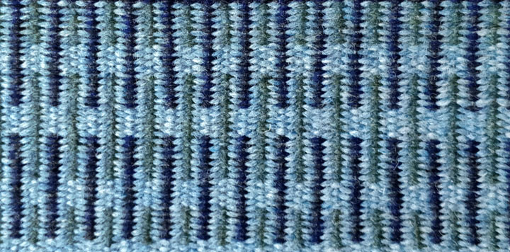
So far I have completed two pattern blocks - as you can see. I was toying with the idea of interlocking them, but I quite liked the separation between the patterns in the sampler so I've kept that aesthetic here.

I originally thought I might go for softer colours with a lower contrast than you normally seem to see in krokbragd. These blues and green certainly produced what I wanted, but I am really liking the striking contrast between the soft grey and the navy and black marl yarn used in the top image, so I suspect the finished rug is going to have a mix of those high and low contrast blocks. It will be interesting to see how the colour scheme progresses. Well I'll be interested to see it.

What are your thoughts? Do you like the low contrast colours or are you all about the sharp definition? Why not share your views in the comments?

Thursday 10 June 2021

Tablet weaving

I finally got around to trying out one of the bands from "Tablet Woven Treasures." It's been a while since I did any card weaving, partly because I really don't enjoy the warping side of card weaving and partly because I've had other projects on the go. I tell myself that I'll make things easier and do a continuous warp and then I fall in love with a pattern that doesn't lend itself to that technique. Cue miles of yarn in coloured groups cut into lengths then threaded and tied on four at a time. Sigh.

And so it was with this band. It is (almost) pattern number 23 in the book and one of the simpler bands with a four forward, four backwards turning routine. With the distraction of a banged up leg (see my previous post) I didn't want anything too complicated. As it was there was some grumpiness when I couldn't get the threads through the fishing swivels. More on those later.

The pattern is a simple threaded in design which I slightly modified. The original archaeological find was a decorative band on a skirt and had an asymmetric border pattern. I swapped over a couple of the colours to create a symmetrical border. I'm thinking of using the finished band on a hat but it might turn into a lead as it's just the right width for that and possibly a little narrow for the hat I have in mind to decorate.

I warped the loom following the instructions presented in a video by "KnowKnots" which uses those fishing swivels I mentioned earlier to reduce problems with twisting yarn and to help maintain even tension across your threads. The swivels are attached to a split ring. I used four swivels per ring. The four threads from one card are tied to the split ring, warped and then the ends are pulled through the other eye of the swivel and tied with a knot which can slide up and down the thread to adjust the tension. When that card's done repeat the process with the rest of them. I should have taken a photo when I first warped the loom so you could see the rings more clearly, but I didn't. Oops! Instead the image shows the view from underneath the loom which kind of shows the rings in action.

The yarn is an 8/2 Orlec from Maurce Brassard that I got when My Fine Weaving Yarns were selling off the end of their Orlec stock. I tend to tablet weave using mercerised cotton but the orlec is perfect for things that need to be hard wearing like bag straps or dog leads and because I got it cheap and there are more than 1,500m of yarn on each cone it is perfect for sampling new patterns.

The colours are very rich as you can see from the blue weft I'm using. The one down side is that using the same yarn for warp and weft I have to work harder at my band edges. Normally I use a warp which is twice the thickness of the weft (or thereabouts) which helps keep the edges tidy as the weft seems to squidge into the softer warp rather than sit on the edge of it. After a slightly untidy start I got back into the swing of things and I'm quite pleased with how the band is coming together now.

When I've finished this band I'm thinking of trying one of the more advanced patterns - number 47 which looks a lot like a sketch of a double helix. Or I might try something in between, an intermediate difficulty if you like. Until then, if you want to try a continuous warp you might want to check out Linda Hendrickson's video here.

If you have any favourite resources for warping or tablet weaving why not give them a shout out in the comments.

Sunday 6 June 2021

A quick hello

I know, I know. I didn't post last week so I definitely owe you a post this week, but it's going to be a day or two later than usual. I came off my bike and for the last week I've been admiring some spectacular coloured bruises as they've developed. Thanks to that little bit of over-excitement my list of errands has grown even longer but that's ok as I mostly ignore it.

So I have some catching up to do but hopefully it'll be the blog's turn for some attention soon. Until then, why not drop me a comment and let me know which is your favourite post so far, and why.

Monday 24 May 2021

Busy, busy, busy

Argh! It's been a super busy week. I am not sure where the time has gone. I haven't warped up any of the tablet weaving patterns from my new book though I have at least chosen which one I want to make first. I think.

Even the krokbragd has had to take a back seat to catching up with other stuff and it's no secret how much I enjoy a bit of krokbragd.

The diary for this coming week is looking even busier, which is hard to imagine, but that's just how it goes sometimes. I doubt there will be much weaving happening this week either. On the plus side I am really going to enjoy crafting when I can get back to it properly.

To keep me sane I have been doing a teeny bit of crafting in the evening. Not that gorgeously bright band you see at the top of this post, I just wanted something pretty up there. I've been crocheting a pair of what I've seen called texting gloves. It might be nearly the end of May but the weather hasn't really warmed up much. It's too warm for winter gloves but too cold for bare hands so I thought I'd try some light weight yarn for the gloves and see how that feels. They're still a work in progress, but maybe I'll post pictures next week if I get them finished by then.

I hope you're making time to do what you enjoy. Why not share what you're working on in the comments.

Sunday 16 May 2021

Tablet weaving

As regular readers will know, I've got krokbragd on my mind at the moment. But I've just received a copy of "Tablet-Woven Treasures - Archaeological Bands from the Finnish Iron Age" by Karisto Maikki and Pasanen Mervi.

It is the long awaited (at least by me) follow up to "Applesies and Fox Noses: Finnish Tabletwoven Bands" which is probably my favourite tablet weaving book.

A quick flick through "Treasures" suggests there are some wonderful patterns which I can't wait to try, but I am trying to focus on one project at a time and with two krokbragd weaves on the go, I really shouldn't be warping up new projects. I wonder how long it will be before I give in and get out the weaving tablets...

So that's all for today folks as I'm going to spend a little "me" time with a cup of tea and a biscuit (or two) reading my new book and trying not to think about which inkle loom to warp up.

What are your go to crafting books? Why not share a recommendation in the comments.

Sunday 9 May 2021

Colour me interested

It is a very grey and grotty day today. The wind is blowing the rain in at 45 degrees; the sky is grey; the colours of the landscape through the sheets of rain are faded to grey. All in all the view outside the window is lacking its usual verdant spring green and cerulean blue sky. So what better day to be thinking about colour. If I can't look at it through the window I can imagine it.

As regular readers will know, I've got krokbragd on my mind at the moment and one of the pointers I kept reading when first exploring the technique was to have high contrast colour choices. As you can see in this early piece the turquoise really pops against the duller brown whereas the light brown agains the fawn has much less contrast.

So how does this relate to colour theory? Well - an understanding of how colours interact can inform the effects likely to be produced by our choice of yarn colour. The image at the top of this post shows a typical colour wheel. The wheel has been divided into groups of hues. Hue is another word for colour (but just to add confusion can also mean a particular shade of a colour). So you might hear someone talk about "reddish hues" meaning a group of colours which have lots of red in their mix.

When painting a hue can be altered by mixing it with black, white or grey. Adding black creates a shade - a darker, richer colour. Adding grey creates a tone - a less vibrant, more subtle version of the hue. Adding white creates a tint which is a paler, more pastel version of the hue. Weavers don't generally get to change the colour of their yarn unless they are also dying their own yarn. So rather than mixing colours it is more a case of thinking how colours interact with each other.

There are lots of ways of thinking about how to combine colours. A common approach is to consider how much contrast you want between the different hues. There are three pure colours - red, yellow and blue - you cannot make them by mixing other colours. They are known as the primary colours. Mix two primary colours and you get the secondary colours, and mix a secondary colour with a primary and you get the tertiary colours as shown.

For maximum contrast choose colours that are opposite each other on the colour wheel. These pairs are known as complementary colours. Examples are red and green, yellow and purple, blue and orange. Complementary colourways are very vibrant, but if that's the look you like - go wild and enjoy the clashes.

A triad of colours, evenly spaced around the colour wheel also creates a vibrant colourway if all hues are used equally. Imagine orange, purple and green all sharing equal space in a design... It could be brilliant for krokbragd as the patterns work really well with high contrast colourways. But if you're after vibrant but not headache inducing having one dominant colour and two accent colours can create a much more pleasing harmony.

For a low contrast pattern you might choose analogous colors. These are groups of three colours which sit next to each other around the colour wheel. So blue, green and turquoise for example would form an analogous group. Such groupings tend to create a harmonious colourway which is easy on the eyes but would also create a lower contrast pattern when woven.

A final consideration is colour context. The appearance of a colour is affected by the colours around it. Red appears more vibrant against black but will appear less vibrant against white. Against turquoise red will appear more vibrant and against orange it will appear duller.

Beginner weavers often pair brightly coloured yarn with white, expecting the colours to pop, but end up with a pastel colurway instead. If you have some luscious coloured yarn you want to show off pair it with black rather than white for maximum effect, particularly if you are creating a balanced weave. White yarn woven with a colour is like adding white paint to a pigment - you end up with a paler, more pastel tint and lose the original vibrancy.

Notice how the same colour blue seems much brighter against the black than it does against the white in this krokbragd sample.

If you are interested in colour theory and particularly how context affects colour perception, I can highly recomment Josef Albers' book Interaction of Colour.

So that was a very brief summary how a knowledge of colour theory can inform your colour choices for weaving and the effects that can be created by those choices. Do you have a favourite book or website that you turn to for colour advice? Why not share it in a comment.