Monday 28 June 2021

Weaving DNA

I've finished the previous band from "Tablet Woven Treasures." and I'm pretty pleased with it. The orlec worked better than expected. It is quite fine and not as squishy as the mercerised cotton I usually like to use, but it created a nice vibrant band, so I'm glad I used it. I was so pleased, I even added the tassels as you can see in the picture. Okay - they aren't the world's best plaited tassels, but as I don't yet know what I'll use the band for I wasn't too fussed about them because chances are they're going to get cut off at some point in the future.

Once that band was off the loom I couldn't wait to warp up with the band I really wanted to make - band number 47. As with all the bands in the book the original was created at some point during the late Iron age. That apparently spans 800 to 1300AD (or 800 to 1300CE if you prefer).

The band caught my eye because the pattern reminded me of a double helix - like the structure of DNA. It was amazing to imagine someone coming up with the pattern all those centuries before the structure of DNA was discovered in the 1950s.

The band's turning pattern is much more complicated than the four forwards, four backwards pattern I'd been "warming up" with when making the blue band. With a mix of half turns and quarter turns which varied with each row I was worried I might lose my place and have to spend ages unravelling rows, so I created a map of the card turns and the resultant card positions. Goodness knows how those Iron age weavers kept track of the sequence.

The idea just came to me. If I knew where the cards were meant to be sitting I could check where any mistakes occurred. The diagram shows the idea. When row X is completed the letter marked on the card in the top position, nearest me is shown in the table. Above that is the next turning pattern and then the letters which will be top-nearest after that row, and so on. Obviously what's shown isn't the actual turning pattern - I don't want to infringe the copyright of the book author's by putting their designs out there without permission. They must have worked incredibly hard to take fragments of Iron Age textiles and turn them into the patterns in the book and I want to respect that.

The science bit

The discovery of the structure of DNA was made in 1953. At the time Francis Crick and James Watson were credited with the discovery but they owed much to the work of Rosalind Franklin and her co-researcher, Raymond Gosling.

Franklin and Gosling's work on DNA and X-ray crystallography led to Gosling capturing the famous Photograph 51 (copyright Raymond Gosling/King's College London). The photograph, which revealed the double helix nature of DNA was shared with James Watson, without Franklin or Gosling's knowledge, and was instrumental in confirming the double helical structure that Crick and Watson went on to present.

I can still recall seeing a copy of photograph 51 durimg an A level physics lesson. It is a thing of beauty and science and it captured my interest and imagination then, as it does today. My woven band is frivolous compared with the work of Franklin et. al. but it thrills me to blend such an important scientific discovery into my textile work.

What inspires your work? Why not share it in a comment so others can be inspired.

Sunday 13 June 2021

Sunshine after the rain (Krokbragd #6)

It is a spectacularly warm and sunny day out there. The kind of day that wreaks havoc with my crafter's "pale and interesting" complexion. So what's a woman to do? Many of my friends are posting images of their newly weeded flower beds, neatly trimmed lawns and other fruits of their gardening labour. I have no interest in gardening though I do very much enjoy the gardens others create, but I forced myself outside for fifteen minutes with a coffee on the patio to top up the vitamin D and then it was back inside to do what I do best: avoid the sun.

So was I relaxing with the inkle loom and that pretty band I warped up earlier in the week? Nope. I was back with the krokbragd.

I know, I know, I keep saying I will just work on a limited number of projects at a time but this is only project number three if you don't count the pile of mending that needs doing and the trousers pattern that I need to recut and...

If you remember from the 21st May 2021 - I was so enjoying working on the krokbragd sampler than I decided to warp up my 24" loom to make a rug for the bedroom.

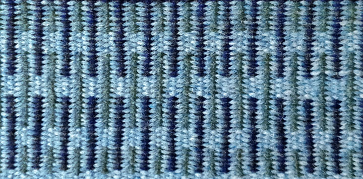
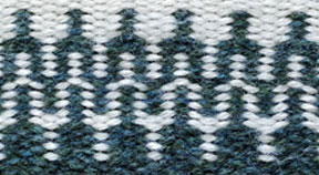
So far I have completed two pattern blocks - as you can see. I was toying with the idea of interlocking them, but I quite liked the separation between the patterns in the sampler so I've kept that aesthetic here.

I originally thought I might go for softer colours with a lower contrast than you normally seem to see in krokbragd. These blues and green certainly produced what I wanted, but I am really liking the striking contrast between the soft grey and the navy and black marl yarn used in the top image, so I suspect the finished rug is going to have a mix of those high and low contrast blocks. It will be interesting to see how the colour scheme progresses. Well I'll be interested to see it.

What are your thoughts? Do you like the low contrast colours or are you all about the sharp definition? Why not share your views in the comments?

Thursday 10 June 2021

Tablet weaving

I finally got around to trying out one of the bands from "Tablet Woven Treasures." It's been a while since I did any card weaving, partly because I really don't enjoy the warping side of card weaving and partly because I've had other projects on the go. I tell myself that I'll make things easier and do a continuous warp and then I fall in love with a pattern that doesn't lend itself to that technique. Cue miles of yarn in coloured groups cut into lengths then threaded and tied on four at a time. Sigh.

And so it was with this band. It is (almost) pattern number 23 in the book and one of the simpler bands with a four forward, four backwards turning routine. With the distraction of a banged up leg (see my previous post) I didn't want anything too complicated. As it was there was some grumpiness when I couldn't get the threads through the fishing swivels. More on those later.

The pattern is a simple threaded in design which I slightly modified. The original archaeological find was a decorative band on a skirt and had an asymmetric border pattern. I swapped over a couple of the colours to create a symmetrical border. I'm thinking of using the finished band on a hat but it might turn into a lead as it's just the right width for that and possibly a little narrow for the hat I have in mind to decorate.

I warped the loom following the instructions presented in a video by "KnowKnots" which uses those fishing swivels I mentioned earlier to reduce problems with twisting yarn and to help maintain even tension across your threads. The swivels are attached to a split ring. I used four swivels per ring. The four threads from one card are tied to the split ring, warped and then the ends are pulled through the other eye of the swivel and tied with a knot which can slide up and down the thread to adjust the tension. When that card's done repeat the process with the rest of them. I should have taken a photo when I first warped the loom so you could see the rings more clearly, but I didn't. Oops! Instead the image shows the view from underneath the loom which kind of shows the rings in action.

The yarn is an 8/2 Orlec from Maurce Brassard that I got when My Fine Weaving Yarns were selling off the end of their Orlec stock. I tend to tablet weave using mercerised cotton but the orlec is perfect for things that need to be hard wearing like bag straps or dog leads and because I got it cheap and there are more than 1,500m of yarn on each cone it is perfect for sampling new patterns.

The colours are very rich as you can see from the blue weft I'm using. The one down side is that using the same yarn for warp and weft I have to work harder at my band edges. Normally I use a warp which is twice the thickness of the weft (or thereabouts) which helps keep the edges tidy as the weft seems to squidge into the softer warp rather than sit on the edge of it. After a slightly untidy start I got back into the swing of things and I'm quite pleased with how the band is coming together now.

When I've finished this band I'm thinking of trying one of the more advanced patterns - number 47 which looks a lot like a sketch of a double helix. Or I might try something in between, an intermediate difficulty if you like. Until then, if you want to try a continuous warp you might want to check out Linda Hendrickson's video here.

If you have any favourite resources for warping or tablet weaving why not give them a shout out in the comments.

Sunday 6 June 2021

A quick hello

I know, I know. I didn't post last week so I definitely owe you a post this week, but it's going to be a day or two later than usual. I came off my bike and for the last week I've been admiring some spectacular coloured bruises as they've developed. Thanks to that little bit of over-excitement my list of errands has grown even longer but that's ok as I mostly ignore it.

So I have some catching up to do but hopefully it'll be the blog's turn for some attention soon. Until then, why not drop me a comment and let me know which is your favourite post so far, and why.

Monday 24 May 2021

Busy, busy, busy

Argh! It's been a super busy week. I am not sure where the time has gone. I haven't warped up any of the tablet weaving patterns from my new book though I have at least chosen which one I want to make first. I think.

Even the krokbragd has had to take a back seat to catching up with other stuff and it's no secret how much I enjoy a bit of krokbragd.

The diary for this coming week is looking even busier, which is hard to imagine, but that's just how it goes sometimes. I doubt there will be much weaving happening this week either. On the plus side I am really going to enjoy crafting when I can get back to it properly.

To keep me sane I have been doing a teeny bit of crafting in the evening. Not that gorgeously bright band you see at the top of this post, I just wanted something pretty up there. I've been crocheting a pair of what I've seen called texting gloves. It might be nearly the end of May but the weather hasn't really warmed up much. It's too warm for winter gloves but too cold for bare hands so I thought I'd try some light weight yarn for the gloves and see how that feels. They're still a work in progress, but maybe I'll post pictures next week if I get them finished by then.

I hope you're making time to do what you enjoy. Why not share what you're working on in the comments.

Sunday 16 May 2021

Tablet weaving

As regular readers will know, I've got krokbragd on my mind at the moment. But I've just received a copy of "Tablet-Woven Treasures - Archaeological Bands from the Finnish Iron Age" by Karisto Maikki and Pasanen Mervi.

It is the long awaited (at least by me) follow up to "Applesies and Fox Noses: Finnish Tabletwoven Bands" which is probably my favourite tablet weaving book.

A quick flick through "Treasures" suggests there are some wonderful patterns which I can't wait to try, but I am trying to focus on one project at a time and with two krokbragd weaves on the go, I really shouldn't be warping up new projects. I wonder how long it will be before I give in and get out the weaving tablets...

So that's all for today folks as I'm going to spend a little "me" time with a cup of tea and a biscuit (or two) reading my new book and trying not to think about which inkle loom to warp up.

What are your go to crafting books? Why not share a recommendation in the comments.

Sunday 9 May 2021

Colour me interested

It is a very grey and grotty day today. The wind is blowing the rain in at 45 degrees; the sky is grey; the colours of the landscape through the sheets of rain are faded to grey. All in all the view outside the window is lacking its usual verdant spring green and cerulean blue sky. So what better day to be thinking about colour. If I can't look at it through the window I can imagine it.

As regular readers will know, I've got krokbragd on my mind at the moment and one of the pointers I kept reading when first exploring the technique was to have high contrast colour choices. As you can see in this early piece the turquoise really pops against the duller brown whereas the light brown agains the fawn has much less contrast.

So how does this relate to colour theory? Well - an understanding of how colours interact can inform the effects likely to be produced by our choice of yarn colour. The image at the top of this post shows a typical colour wheel. The wheel has been divided into groups of hues. Hue is another word for colour (but just to add confusion can also mean a particular shade of a colour). So you might hear someone talk about "reddish hues" meaning a group of colours which have lots of red in their mix.

When painting a hue can be altered by mixing it with black, white or grey. Adding black creates a shade - a darker, richer colour. Adding grey creates a tone - a less vibrant, more subtle version of the hue. Adding white creates a tint which is a paler, more pastel version of the hue. Weavers don't generally get to change the colour of their yarn unless they are also dying their own yarn. So rather than mixing colours it is more a case of thinking how colours interact with each other.

There are lots of ways of thinking about how to combine colours. A common approach is to consider how much contrast you want between the different hues. There are three pure colours - red, yellow and blue - you cannot make them by mixing other colours. They are known as the primary colours. Mix two primary colours and you get the secondary colours, and mix a secondary colour with a primary and you get the tertiary colours as shown.

For maximum contrast choose colours that are opposite each other on the colour wheel. These pairs are known as complementary colours. Examples are red and green, yellow and purple, blue and orange. Complementary colourways are very vibrant, but if that's the look you like - go wild and enjoy the clashes.

A triad of colours, evenly spaced around the colour wheel also creates a vibrant colourway if all hues are used equally. Imagine orange, purple and green all sharing equal space in a design... It could be brilliant for krokbragd as the patterns work really well with high contrast colourways. But if you're after vibrant but not headache inducing having one dominant colour and two accent colours can create a much more pleasing harmony.

For a low contrast pattern you might choose analogous colors. These are groups of three colours which sit next to each other around the colour wheel. So blue, green and turquoise for example would form an analogous group. Such groupings tend to create a harmonious colourway which is easy on the eyes but would also create a lower contrast pattern when woven.

A final consideration is colour context. The appearance of a colour is affected by the colours around it. Red appears more vibrant against black but will appear less vibrant against white. Against turquoise red will appear more vibrant and against orange it will appear duller.

Beginner weavers often pair brightly coloured yarn with white, expecting the colours to pop, but end up with a pastel colurway instead. If you have some luscious coloured yarn you want to show off pair it with black rather than white for maximum effect, particularly if you are creating a balanced weave. White yarn woven with a colour is like adding white paint to a pigment - you end up with a paler, more pastel tint and lose the original vibrancy.

Notice how the same colour blue seems much brighter against the black than it does against the white in this krokbragd sample.

If you are interested in colour theory and particularly how context affects colour perception, I can highly recomment Josef Albers' book Interaction of Colour.

So that was a very brief summary how a knowledge of colour theory can inform your colour choices for weaving and the effects that can be created by those choices. Do you have a favourite book or website that you turn to for colour advice? Why not share it in a comment.

Sunday 2 May 2021

Sampler samples (Krokbragd #5)

The krokbragd sampler is coming along nicely. I'm very much enjoying the design process and working with a limited palette of colours. A trawl of the internet reveals there are lots of examples of krokbragd with a rainbow of colours but I felt drawn to some of the more muted colour schemes. Don't get me wrong some of those brightly coloured designs are gorgeous - okay, they're all gorgeous it's in the nature of the weave - but I like my decor to be more gentle on the eye, the colours of the coastal landscape are my go to paint samples.

I toyed with the idea of going all natural and maybe sourcing some undyed alpaca but decided to work with what I already had rather than splash the cash. After all I bought that yarn because I thought it was lovely and letting it sit in a box isn't the best way to use it.

After trying colours against each other I chose some British wool I'd bought from a weaver in Scotland who was having a de-stash. I decided to use just three colours throughout the sampler - cream, blue and green - to let the patterns speak for themselves rather than let the colours be the star of the show.

The first image is overlapping bars. I think of it as being a more modernist take on krokbragd. With bars of various lengths it could make for a very interesting pattern and kind of reminds me of some of Anni Albers' weaving. Perhaps not up there with the Bauhaus trained weavers but it has a pleasing rhythm when you see it across the width of the fabric.

The second pattern I think of as interlocking tuning forks. There is something fascinating about the way the patterns interlock and change colour at the same time. Perhaps if MC Escher had been a weaver this is the kind of pattern he might have come up with. I think it deserves a variation with more colours to really show off the colour changes. One to think about when I'm back to the design sheet.

So that's a little taster of what I've been working on and I've enjoyed the process so much that I took some of the money I saved by not buying a load of alpaca and finally bought a set of double heddle blocks for my 24" loom. I had considered selling it a while back but now I am going to warp it up and make myself a lusciously thick krokbragd mat for the bedroom. Just the thing to step onto when the mornings get cold again.

So what's inspiring your work at the moment? Why not share it in a comment

Sunday 25 April 2021

Love, love, love

Browsing through the images on a textile group I came across a post about how difficult it is to give away (or sell) one's work. The author told how she can't bear to part with things after putting her all into making them. Each to their own of course, but I really enjoy the gift of giving whether as a gift or a commission. When someone tells me how much they love what I've made for them it makes me so happy but in the wider context, giving a gift is a way of telling someone how much you love them.

Over the last year the pandemic has separated us from each other, from family and friends. Some like that isolation - more time to craft. Others struggle with all that alone time and while phone calls and video chat provide some opportunities to connect not everyone is comfortable saying what they feel in person, let alone to a face on a screen. Sometimes the words are left unsaid because the person on the receiving end would feel awkward if you were to "go all mushy" on them. Sometimes you just get distracted and instead of telling someone how much they mean to you (or whatever else it was you wanted to say) you blether on about everything but the one thing you rang them to say. Trust me - I know. It's like the more important something is to say the more often I put the phone down and then think "Darn! I didn't tell them..."

It can be easier to communicate love and affection physically - a hug, a kiss, holding a rigorously sanitised hand, but that isn't always an option during lockdown. Sometimes it is easier to let something else speak for you. There is that saying, "when words fail, music speaks." Is it any wonder mix tapes, or their modern equivalent the play list, are so popular? (If you're interested the saying is a paraphrase of "where words fail, sounds can often speak" from "What the Moon Saw" by Hans Christian Anderson. Available from Project Gutenberg here). Another variation is that "a picture paints a thousand words." Again saying the unsayable through one of the arts. And that takes me back to the textile group post and why we should give things to others.

Choosing and sending a gift to someone is a way to support artists and artisans, but also a way to say the unsayable - to say "I care about you; I love you; I value you; thank you for being a part of my life; my life is better for you being in it." You get the idea. Giving another person that carefully chosen gift is a way to say "I love you" when the words are hard to speak for whatever reason.

And because today's theme is gifting and love I've chosen an image of a lavender pillow I made. The machine embroidery is the chemical compound oxytocin. Among other things oxytocin is the hormone most associated with bonding and relationships. It's what makes you want to cuddle when you drift off to sleep after intimacy and also contributes to the feeling of contentment within a relationship, romantic or otherwise. I could have let the pillow go to a new owner, but I decided to keep it for myself, to remind me that I am loved, even by those who might not be able to say it. It is a gift I have given to myself.

What do you think? Do you have difficulties letting go of your creations? What gift would you give to say "I love you"?

Saturday 17 April 2021

Return to Krokbragd (Krokbragd #4)

It felt like the time was right for more Krokbragd. I am toying with the idea of putting together a book, maybe more like a booklet, of patterns for rigid heddle weavers with double heddle blocks. Even if I'm the only person who reads it I think it will be a useful project and a great way of designing a Krokbragd sampler.

I find the idea using two heddles suits me much better than making string heddles or using pick up sticks for Krokbragd. Using two heddles make the process faster and really easy, and I keep my string heddles for inkle weaving.

Obviously any design is only as good as it looks in the weft, not on paper (or screen) so task number one was warping up the loom ready for weaving. Task number two start designing. This post is about the warping process. Back in Krokbragd #3 I posted the above warping diagram for double heddles - back heddle at the top of the diagram, front heddle at the bottom.

I thought it might be useful to see what the warping diagram looks like in reality. To tie in with the diagram I used three different colours for the warp. Remember - the warp will be completely covered by the weft so the colours don't matter. I had a lack of suitable green yarn, so I've used white instead.

Notice how there are twice as many white (green) threads. They form the two instances of shed 2 colour in the 1 2 3 2, 1 2 3 2 weft pattern in a single weft pass. What that means is although it looks like there should be four actions per pattern row (1 2 3 2) each pattern is actually made up of three passes of weft colour not four.

With the different coloured warps it is easy to see the three separate sheds. With both heddles in the up position the "pixel" of weft colour will appear over the shed 1 warp. Red in the diagram.

When the front heddle is in the down position and the back heddle is in neutral then the "pixel" of warp colour will be in the repeated shed 2 positions. Notice how the white warp threads appear closer together - because there are twice as many of them.

Finally when the back heddle is down and the front heddle is in neutral the weft "pixels" will appear over the shed 3 warp. In all three pictures the back beam is on the right hand side of the image so the back heddle is what can be seen in the second and third images in the series of heddle position photos.

To complete the series of images the same colours of yarn were used to spread the warp - to show how the weft would build up into a pattern. You can see the 1 2 3 2, 1 2 3 2 repeats of the red white blue white red... The weft hasn't been beaten down as it would for actual Krokbragd but hopefully the images will help you to make more sense of the previous Krokbragd posts.

If you've found the images useful why not let me know with a comment.

Sunday 11 April 2021

Poppana

When it comes to weaving I find myself drawn to the patterns and techniques of the Nordic countries. I won't say Scandinavia because while Denmark, Sweden and Norway count as "Scandi" Finland does not and it is from Finland that I often find inspiration. A more inclusive term might be the "Nordic" countries which as well as the four mentioned above includes the Faroe Islands, Greenland, and Ã…land.

If you're interested in the difference between Nordic and Scandinavian you might look here for info on Scandinavia or here for info on the Nordic countries.

But back to weaving. The technique that I've been exploring recently is called poppana weaving. It ties in nicely with the "make every scrap count" approach to yarn and fabric that I'm trying to achieve.

Poppana is a Finnish technique but similar approaches are seen in other cultures. For example in Japan sakiori weaving (from "saki," which means to tear or rip up, and "ori," which means weave) has the same basis - recycling and reusing old fabric to prolong its useful life.

Poppana was developed as a way to recyle old bedding and clothes by cutting them into narrow strips and weaving them into durable fabrics for rugs, winter coats, bedspreads, horse blankets, etc. Later the technique developed to include clothes woven using thinner strips of lighter weight cottons.

The fabric shown was woven on an Ashford Sampleit loom with a 5/2 mercerised cotton on a 7.5 dpi heddle. I wanted the rags to really show up and the craft cotton I usually use for tapestry weaving is just that bit thicker than the 5/2. The cotton was also used for alternating sheds of the weft to create a gridlike pattern rather than the more usual staggered pops of warp colour. One shuttle was wrapped with the cotton and the other with the poppana strips. As this was a sample piece I didn't go crazy with the colour of the mercerised cotton, opting for an unbleached colour to go with the natural tones in the fabric.

The strips were cut from scraps of fabric so there weren't any really long pieces like you'd get from a bed sheet or duvet cover or from spiral cutting a teeshirt. They were joined together using the slit technique described by Jenny at Crochet is the way. If you don't have any old bedding or clothes you want to recycle then you can buy premade poppana strips from Finnish stores such as Toika or Lankava but I made my own. The half inch strips I cut from left over upholstery fabric are not as elegant as the precut 8mm and 10mm cotton strips you can buy but they did the job.

I cut the fabric any old how, depending on the longest length of the scrap I was cutting. Traditionally the strips would be cut on the bias which can give a frayed edge, cheneille texture to the woven fabric. There are a few fraying edges but not really enough to call it a featuer, so I might trim out the more noticable ones.

There is enough fabric to make a wine carrier or a small bag. I'm leaning towards a wine carrier for when we get to go to parties again. One of my inkle bands would make a strong handle and the thickness of the poppana fabric would hopefully act as a little insulation to keep the wine bottle chilled during the journey.

What's inspiring you at the moment? Any new techniques you've been trying? Add a comment and share your new passion.

Sunday 4 April 2021

It's written in the stars above

It's all go in the craft cave. Lots of sewing to be done this week as I've more than a few birthdays coming up.

I've been trying out a new pattern from Sew Sweetness - the Persimmon Dumpling Pouch. I've seen several of the pouches on a "sewing your hand woven fabric" group and thought the shape was very pleasing.

I didn't want to start cutting into my handwoven fabric before doing a trial run so when I started reading about the pattern I was delighted to see it was actually designed to be a scrap buster - to be made from off cuts and oddments. I've become increasingly eager to use up every scrap of fabric so scrap buster ideas are my new "go to" patterns.

When I got out my box of fabric scraps there on top was a bag of odd shaped bits of felt which I'd zigzagged into fabric. There was just enough of the patchwork to make the smallest size of the pouch. I had some purple cotton left over from a recent quilt which felt like the right colour for the lining. No purple zips as I buy them by the metre in neutral colours but a mid-toned grey looked good with the purple so in less than five minutes I had all my materials' choices made and I was ready to start on my least favourite part of the process - cutting out.

While I was cutting out the pattern I started thinking about what other projects I need to get underway and my mind turned to the number of upcoming birthdays in my diary.

I don't generally believe in horoscopes. I mean - what are the chances that everyone born under a particular star sign is going to have the same kind of day, or that they're going to be compatible with someone born under some particular other star sign? But when I thought of the list of upcoming birthdays I began to wonder if maybe I'm wrong.

I clearly have some kind of affiliation with those born under the sign of Aries? After December (ie. Christmas) April is the month when I send out the most cards and gifts. I don't know what it is about those Aries people but we do seem to make lasting connections. So I need to get off the computer and back to the craft cave. Those cards and presents aren't making themselves.

Having tried out the Persimmon Dumpling Pouch and enjoyed the process I can definitely see some of those in my friends' futures.

Do you have a particular month bursting with birthdays? What are your "go to" gift pattens for the special people in your life. Why not add a link to your favourite in the comments.

Monday 29 March 2021

Busy, busy

It's been a very busy week here at KiniB. So just a quick hello today.

The image is a Sami band (a narrow band based on the traditional weaving patterns of the Sami people of northern Scandanavia). The bands would traditionally be woven in wool so would have a denser weave than the Orlec thread I used, but as test pieces go, I'm pleased with it.

The traditional bands would be used for many things, such as wrapping the bottoms of trousers tightly to the wearer's boots - to keep the snow and cold air out. I'm not sure what this band will become, but I think it would make a fantastic light (or bell) pull, so I've plaited the ends to keep it neat while I decide what to do with it.

The pattern is a pick up type weave made using a Sunna heddle with my 10" Ashford loom. The pattern is from "Weaving Sami Bands" by Susan J Foulkes. Catch her blog at Durham Weaver.

I really love the weaving patterns of the Nordic countries. What are your favourite weaving inspirations? Leave a comment and let me know.

Sunday 21 March 2021

Mossy inspiration

I've been experimenting on and off with different ways of creating visual textures for art quilt backgrounds. I've tried felting, confetti quilting (great for using up tiny fabric scraps), painting but this week I've been playing around with digital images which I could fabric print at home, or turn into a print on demand dressmaking fabric.

The vernal equinox occurred on Saturday (20th March 2021). At an equinox the sun appears directly over the equator and day and night are the same length. In the spring the equinox marks the start of lengthening days and the promise of better weather. Blue skies and green shoots appearing on the twiglike hedges put me in the mood for a plant inspired print. I thought of the Versace dress made famous by Jennifer Lopez (among others) and got distracted away from art quilts to dressmaking fabrics.

I first dabbled with print on demand fabric a few years back when I was invited to a wedding loosely themed on the TV show, Doctor Who. For the pattern to repeat properly over the width and length of the fabric it is essential to either design a full width image or to create a repeatable, tessellating image. For the wedding outfit I created a full width image with a repeat along the length of the fabric. If you study the top and bottom of the image you can see where the repeat starts again. Trying to recall the lessons I learned back then I set about designing a new spring fabric. But first to find some inspiration.

With lockdown still ongoing my first thought was to use images of spring flowers from the garden, but I wasn't sure I wanted to look like a walking drift of daffodils. Something more abstract felt like the way forward. A few years back I used to collect textures for a graphic designer of my acquaintance. Rock formations, seaweed, sand ripples on the beach after the tide goes out... You get the idea - the kind of things a city dweller wasn't likely to get their camera on without a trip to the coast. Surely I could find something there.

Nope. - The beach textures weren't really saying spring so I eventually selected an image of some sphagnum moss in a verdant shade of green. I isolated one of the rosettes, reflecting it horizontally and vertically to create a four rosette motif which could then be repeated as a textile print. I liked the way the reddish tips fade into the black background and the contrast between the vivid green against black, but it wasn't quite was I was imagining. That black wasn't really chanelling spring for me.

For version two I chose a green from within the rosette's colour palette to create a softer colour for the background. To give the print some more visual interest I duplicated the layer and offset it to fill some of the blank space then faded it to 75% opacity so it would create some depth.

That created a more pleasing pattern but it still had a strong grid like quality to it. Perhaps playing around with scale could improve that.

Increasing the size of the background pattern created a more interesting texture which would still tessellate - could be repeated to fit any fabric width. That is the image at the top of the post.

A more densely textured image was created by enlarging and rotating an extra layer of the motif but the rotation meant that the edges of the pattern would no longer interlock to create a repeating pattern over any width or length of fabric. That would work for a quilt background but not a dressmaking fabric though it might be fixable if I crop the image along the centre of the darker rosettes. Something to play with on another day.

What do you think? Did I do the sphagnum moss justice? Which is your favourite print? Have you ever tried creating print on demand fabrics? Who did your printing for you? Why not give them a shout out in the comments. Or let me know if you'd like to see a tutorial on creating repeat patterns.

Wednesday 17 March 2021

The sun's mirror

A bonus mid-week post.

Since my moon post on the 10th March, our nearest neighbour in space has been on my mind a lot. Partly that's because the new moon (or "dark moon" if you prefer) was on 13th March and the nights have been so dark the sheep are invisible. There is little light pollution where I live so the moon really is the light in our night sky.

Just as some people suffer from Seasonally Affected Disorder and crave sunlight during the winter months, I miss the moon when she goes dark. If I'm trying to photograph something else, like meteors or the Milky Way, then of course a dark moon makes that easier but when night after night ths sky is dark it feels like something is missing, even though she's still there waiting for the sun to light her up her familiar face once more.

Of course, the moon has held meaning for those who observe her for thousands, maybe millions, of years and while I can't presume to know what feelings others experience when they look up at the night sky I recently heard Sandi Toksvig talk about what it means to her.

Looking for something relaxing to listen to on the radio I came across some episodes of a show called "Sandi Toksvig's Hygge" - prounonce that "hoo-ga." What could be more relaxing than Sandi talking to her guests about what simple pleasures bring them contentment? So over a few evenings as I chopped the veg for dinner I listened to the show.

The episode that really stuck out of me was episode three - available here for those who can access iPlayer/BBC Sounds. Sandi talks about when her children were young and she was doing a lot of travelling in the days before mobile phones were in almost everyone's pockets. Sometimes she was in places where phoning home might not be possible. She told her children, "It doesn't matter where I am in the world guys. If I look up at the moon at night please know that when you look up at the moon at night we're looking at the same moon." She continued, "So instead of saying I love you, my kids and I, we say 'same moon' because wherever we are in the world, it connects us." I thought in these physically distanced times that was a wonderful thought and worth sharing. Hopefully Sandi won't mind, given that she said it on the radio.

Time and technology have of course moved on and now we can phone, or message, Skype or email, even pop a bit of niff naff on Facebook to say we're still here. And I encourage you to do that. Let those you love know you are okay. But when words fail you, look up at the night sky, look at the moon and know that when those you love look up you're both looking at the same moon and you are connected.

The image accompanying this post is a composite of images I took during the 2007 total lunar eclipse. If you want to see some moon inspired crafting and are on Facebook or Instagram look up "Passyflora Design" in particular her wonderful patchwork and thread-painted image of the full moon.

Do you miss the moon? Has it inspired you in your crafting? Why not share a link to your favourite moon inspired image or tell me who you'll think of the next time you look up at the moon. It's okay - I won't tell.

Monday 15 March 2021

Paint the whole world with a rainbow

I've been on a bit of a frugality trip when it comes to the craft cave. In part that was due to lockdown - my favourite yarn and fabric shops were closed to "in person" shopping and I find buying online a bit of a lottery unless I know the exact thing I want. I've also been concerned about the amount of waste crafting can create. Not every pattern tessellates (fits together without gaps) and particularly when dressmaking there are lots of "scraps."

I've been thinking of ways to work with those small irregular pieces so that every scrap gets used and the thing that seemed perfect for the zeitgeist was to turn them into fabric cards and postcards.

Just because you can't go on holiday doesn't mean you can't send a post card. While we were all physically distancing (I prefer that term to socially distancing) I thought it would be nice to add personal touches when communicating the old fashioned way - with paper and ink. So instead of sending commerical cards I've made my own. Some I've sandwiched into card frames, others I've turned into post cards by sewing them onto a card backing.

I started playing around with abstract designs - getting a feel for the process. Next I made a few picture cards in my favoured palette of blues and greens, but then I decided I wanted to go bold and a bag of cotton oddments provided the perfect inspiration - rainbows.

Rainbows were everywhere in 2020. They were adopted as a symbol of support for the NHS and its workers. Before that the rainbow flag was adopted as a symbol of the LGBT community and before that a symbol of peace and hope and before that... You get the idea. For all those reasons a rainbow of colours felt like an image people might like to receive.

I cut strips from the offcuts of quilting cotton and sewed them onto scraps of interfacing (or stabiliser as it is also known). While the finished design doesn't have that familiar rainbow arc I think the pattern definitely says rainbow and hopefully brings a smile to the faces of those who receive the cards.

The science bit

It occurred to me that while I knew the basic idea of how a rainbow is formed - the colours which make up white light are scattered (spread out) as they pass through water droplets - I'd never really thought about why a rainbow is circular (though only part of the circle is seen from the Earth's surface).

My first draft of this post got quite technical but I've pared it back to hopefully something a little less like a physics lecture.

When white light (like daylight) passes through raindrops it changes speed. It slows down when it enters the raindrop and speeds up again when it goes back into air. That change in speed makes the light ray bend, a phenomenon known as refraction. It's like when you go from moving in air to moving in water. Water resists your movement more than air so you go slower.

The image with the triangle represents what happens when white light is shone at a glass prism (a bar of glass shaped like a Toblerone (TM).

Light rays are refracted as they enter the glass prism but different colours of light slow down by different amounts. Blue light in glass slows down (refracts more) more than red light, so blue light refracts/bends more. Because the different colours bend by different amounts they become spread out into a rainbow. This is called dispersion. The same thing happens when light hits a rain drop, but some of the light also reflects off the back of the raindrop.

It is the reflections which produces the familiar shape of the rainbow. The light reflects most strongly, so appears brighter, when the sun's rays hit the raindrop at around 42 degrees. When you have lots of raindrops reflecting light at around 42 degrees that light forms a cone as seen from your eye and it is that cone which gives the rainbow its shape.

More information on rainbow formation can be found here and there are lots of physics sites which explain more about reflection and refraction.

I hope you liked the cards even if you didn't read "the science bit." Why not post a comment or drop me an email (the address is on the website) and let me know what you make with your fabric scraps, or what picture you'd like to see if a card were to drop onto your mat.

For next Monday's post I'm already feeling inspired by some close up pictures of moss I found. Where will that inspiration lead? Come back next week and find out.

Wednesday 10 March 2021

I'm still here

It has been a while since I updated the blog. Crikey - nearly two years. So why post now? Well, a very dear friend pointed out that during these uncertain and scary times people don't always want to ring and check why you've "gone quiet" in case the news is bad. They pointed out that regular updates let people know I am still here (because despite its best efforts, not everyone is on Facebook). So here I am signing in to let you know lovely readers that I am still doing my thing.

I've been focussed more on back garden photography and writing than on painting or sewing over the last year and a bit, so to whet your appetite before a proper update here is an image I shot of the moon.

What we think of as the surface of the moon is actually regolith. Isn't that a wonderful word. It is the loose dust and broken rocks that cover the actual surface of the moon. It is mostly made up of the materials found in that area of the moon but also contains traces of material from distant impact crators.

When we look at the moon, even with our naked eyes, we see the dark areas - the maria - which are large areas of cooled basalt lava. Those areas tend to be higher in iron and magnesium. Some of those basalts are high in ilemite - an iron-titanium oxide. The areas of the moon that appear lighter are the lunar highlands. They are predominantly calcium rich rather than iron.

The colours of the photograph have been boosted to show the different colours of the moon's surface (or regolith) mineral content. The bluer areas are rich in ilmenite. So the blue areas reveal titanium rich deposits. The purple and orange areas contain less titanium. The white areas contain more calcium.

So there you go - a little art, a little geology. I hope you found it interesting. Please leave a comment if you enjoyed the read. And while you're at it why not pick up the phone, send an email, send a text, comment on a Facebook post, let people know you're still there, doing your thing.