Monday 24 May 2021

Busy, busy, busy

Argh! It's been a super busy week. I am not sure where the time has gone. I haven't warped up any of the tablet weaving patterns from my new book though I have at least chosen which one I want to make first. I think.

Even the krokbragd has had to take a back seat to catching up with other stuff and it's no secret how much I enjoy a bit of krokbragd.

The diary for this coming week is looking even busier, which is hard to imagine, but that's just how it goes sometimes. I doubt there will be much weaving happening this week either. On the plus side I am really going to enjoy crafting when I can get back to it properly.

To keep me sane I have been doing a teeny bit of crafting in the evening. Not that gorgeously bright band you see at the top of this post, I just wanted something pretty up there. I've been crocheting a pair of what I've seen called texting gloves. It might be nearly the end of May but the weather hasn't really warmed up much. It's too warm for winter gloves but too cold for bare hands so I thought I'd try some light weight yarn for the gloves and see how that feels. They're still a work in progress, but maybe I'll post pictures next week if I get them finished by then.

I hope you're making time to do what you enjoy. Why not share what you're working on in the comments.

Sunday 16 May 2021

Tablet weaving

As regular readers will know, I've got krokbragd on my mind at the moment. But I've just received a copy of "Tablet-Woven Treasures - Archaeological Bands from the Finnish Iron Age" by Karisto Maikki and Pasanen Mervi.

It is the long awaited (at least by me) follow up to "Applesies and Fox Noses: Finnish Tabletwoven Bands" which is probably my favourite tablet weaving book.

A quick flick through "Treasures" suggests there are some wonderful patterns which I can't wait to try, but I am trying to focus on one project at a time and with two krokbragd weaves on the go, I really shouldn't be warping up new projects. I wonder how long it will be before I give in and get out the weaving tablets...

So that's all for today folks as I'm going to spend a little "me" time with a cup of tea and a biscuit (or two) reading my new book and trying not to think about which inkle loom to warp up.

What are your go to crafting books? Why not share a recommendation in the comments.

Sunday 9 May 2021

Colour me interested

It is a very grey and grotty day today. The wind is blowing the rain in at 45 degrees; the sky is grey; the colours of the landscape through the sheets of rain are faded to grey. All in all the view outside the window is lacking its usual verdant spring green and cerulean blue sky. So what better day to be thinking about colour. If I can't look at it through the window I can imagine it.

As regular readers will know, I've got krokbragd on my mind at the moment and one of the pointers I kept reading when first exploring the technique was to have high contrast colour choices. As you can see in this early piece the turquoise really pops against the duller brown whereas the light brown agains the fawn has much less contrast.

So how does this relate to colour theory? Well - an understanding of how colours interact can inform the effects likely to be produced by our choice of yarn colour. The image at the top of this post shows a typical colour wheel. The wheel has been divided into groups of hues. Hue is another word for colour (but just to add confusion can also mean a particular shade of a colour). So you might hear someone talk about "reddish hues" meaning a group of colours which have lots of red in their mix.

When painting a hue can be altered by mixing it with black, white or grey. Adding black creates a shade - a darker, richer colour. Adding grey creates a tone - a less vibrant, more subtle version of the hue. Adding white creates a tint which is a paler, more pastel version of the hue. Weavers don't generally get to change the colour of their yarn unless they are also dying their own yarn. So rather than mixing colours it is more a case of thinking how colours interact with each other.

There are lots of ways of thinking about how to combine colours. A common approach is to consider how much contrast you want between the different hues. There are three pure colours - red, yellow and blue - you cannot make them by mixing other colours. They are known as the primary colours. Mix two primary colours and you get the secondary colours, and mix a secondary colour with a primary and you get the tertiary colours as shown.

For maximum contrast choose colours that are opposite each other on the colour wheel. These pairs are known as complementary colours. Examples are red and green, yellow and purple, blue and orange. Complementary colourways are very vibrant, but if that's the look you like - go wild and enjoy the clashes.

A triad of colours, evenly spaced around the colour wheel also creates a vibrant colourway if all hues are used equally. Imagine orange, purple and green all sharing equal space in a design... It could be brilliant for krokbragd as the patterns work really well with high contrast colourways. But if you're after vibrant but not headache inducing having one dominant colour and two accent colours can create a much more pleasing harmony.

For a low contrast pattern you might choose analogous colors. These are groups of three colours which sit next to each other around the colour wheel. So blue, green and turquoise for example would form an analogous group. Such groupings tend to create a harmonious colourway which is easy on the eyes but would also create a lower contrast pattern when woven.

A final consideration is colour context. The appearance of a colour is affected by the colours around it. Red appears more vibrant against black but will appear less vibrant against white. Against turquoise red will appear more vibrant and against orange it will appear duller.

Beginner weavers often pair brightly coloured yarn with white, expecting the colours to pop, but end up with a pastel colurway instead. If you have some luscious coloured yarn you want to show off pair it with black rather than white for maximum effect, particularly if you are creating a balanced weave. White yarn woven with a colour is like adding white paint to a pigment - you end up with a paler, more pastel tint and lose the original vibrancy.

Notice how the same colour blue seems much brighter against the black than it does against the white in this krokbragd sample.

If you are interested in colour theory and particularly how context affects colour perception, I can highly recomment Josef Albers' book Interaction of Colour.

So that was a very brief summary how a knowledge of colour theory can inform your colour choices for weaving and the effects that can be created by those choices. Do you have a favourite book or website that you turn to for colour advice? Why not share it in a comment.

Sunday 2 May 2021

Sampler samples (Krokbragd #5)

The krokbragd sampler is coming along nicely. I'm very much enjoying the design process and working with a limited palette of colours. A trawl of the internet reveals there are lots of examples of krokbragd with a rainbow of colours but I felt drawn to some of the more muted colour schemes. Don't get me wrong some of those brightly coloured designs are gorgeous - okay, they're all gorgeous it's in the nature of the weave - but I like my decor to be more gentle on the eye, the colours of the coastal landscape are my go to paint samples.

I toyed with the idea of going all natural and maybe sourcing some undyed alpaca but decided to work with what I already had rather than splash the cash. After all I bought that yarn because I thought it was lovely and letting it sit in a box isn't the best way to use it.

After trying colours against each other I chose some British wool I'd bought from a weaver in Scotland who was having a de-stash. I decided to use just three colours throughout the sampler - cream, blue and green - to let the patterns speak for themselves rather than let the colours be the star of the show.

The first image is overlapping bars. I think of it as being a more modernist take on krokbragd. With bars of various lengths it could make for a very interesting pattern and kind of reminds me of some of Anni Albers' weaving. Perhaps not up there with the Bauhaus trained weavers but it has a pleasing rhythm when you see it across the width of the fabric.

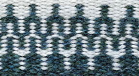
The second pattern I think of as interlocking tuning forks. There is something fascinating about the way the patterns interlock and change colour at the same time. Perhaps if MC Escher had been a weaver this is the kind of pattern he might have come up with. I think it deserves a variation with more colours to really show off the colour changes. One to think about when I'm back to the design sheet.

So that's a little taster of what I've been working on and I've enjoyed the process so much that I took some of the money I saved by not buying a load of alpaca and finally bought a set of double heddle blocks for my 24" loom. I had considered selling it a while back but now I am going to warp it up and make myself a lusciously thick krokbragd mat for the bedroom. Just the thing to step onto when the mornings get cold again.

So what's inspiring your work at the moment? Why not share it in a comment